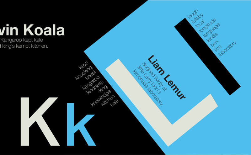
The concept for this project is a children’s learning device in the form of an alphabet book titled “Swiss Alphabetic.” The book features Swiss typography and design.
The book is designed for children learning the alphabet or beginning to sound out words. A secondary audience is designers who enjoy Swiss typography or who have children to read the book with.
As a children’s alphabet book, the shapes and colors stand out while emphasizing and repeating the letterform featured on each page or spread. While Swiss typography can often be more rigid than what is standard for a children’s book, the repetitive patterns, over-emphasized scale of letterforms, and striking colors help hold a child’s attention.
Blake Dodgen